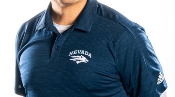


New coach, new era, new attitude. Every coach wants to place his or her stamp on their program, and one of the most visible ways to do that is to design a new uniform.
Eric Musselman has had a number of iterations of the basketball uniform that have helped generate interest in the basketball program’s success. Example uniform themes include: breast cancer awareness, “Team Unity” the Nike N7 campaign and “Battle born”. Each of these uniforms have been used for special occasions and have generated positive feedback.
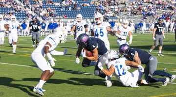
On the other hand, when Brian Polian changed the classic Nevada colors and went toward a more modern look for the football team, it created a lot of division between the fanbase. Since his tenure led to his eventual firing, the uniforms evoke bad memories for a lot of fans.
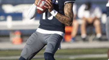
It makes sense that new Nevada Football coach Jay Norvell designed new uniforms for his debut season. Norvell notes that the uniform change was made to usher a culture of “Nevada Grit.”
“We were looking for a clean, classic look,” Norvell said. “Something that was simple. We wanted to have a blue collar feel, because those type of people grind it out every day, just like we do with our Nevada grit.”
The new uniforms feature two different tops: a cream and a blue version. The tops can be made into a combination with two pants: silver pants with a “Battle Born” insignia with “Battle Born” written across both sides and a plain cream-colored version.
In addition, the players’ names will be added to the back of the jersey tops, the first time since 2013, the year when Polian first introduced new uniforms.
Personally, I am lukewarm about these new uniforms. While I didn’t like Polian’s uniforms, these don’t really make me feel too terribly one way or the other. In essence, they’re very bland, which I guess is appropriate for the blue-collar culture Norvell is trying to push.
I have to give credit to whoever designed the silver pants. As a Browns fan, one of the things I absolutely hate about their uniforms is the lettering across the side of the pants. Those belong on college uniforms, a feature that I really liked about Nevada’s pants. In addition, the Battle Born patch adds a nice touch.
Also, the matte with a gray-speckle finish is also commendable. The sheen adds a pleasant, subtle addition to the classic helmet.
In regard to the jersey tops, my biggest criticism is actually pretty minor. The way it is now, I would say the uniforms make it look too much like the Oklahoma Sooners’ uniforms, a previous stop for Norvell. One timeless correction that would mesh well in connecting the roots of the Wolf Pack to the past is to change that font to the “Script Pack” lettering of the 1990s. Not only does it make it distinguishable from other opponents, it pays homage to the roots of the program, while not being too flashy. It would most likely make these uniforms an all-time favorite.
At the end of the day, what I think of these uniforms probably does not matter in the grand scheme of things. Should the football team have success in the next few years, these will most likely be viewed favorably by the fans.
Overall, while the uniforms are not something that wowed me, the uniforms are a solid addition to the uniform history of the Wolf Pack. Like Norvell said, they’re very clean and provide a classic look.